Call it a style secret or a winning wardrobe formula — Princess Kate is a mastermind when it comes to monochrome. Gone are the days of playful prints, mismatched heels and clashing clutches — nowadays, the princess specializes in full matchy-matchy monochrome styles.
As she prepares to ascend the throne and become queen, Kate is ditching the dainty day dresses with their conflicting colors and patterned print in favor of streamlined styles in the same hue. Looking longer, leaner and taller is easier with some of Kate’s monochrome magic.
Many theories abound as to why the princess has embraced a congruent and coordinating color palette — the benefits of monochrome dressing are many — the look creates the illusion of length and height, offers the wearer an easy outfit to assemble and creates clean lines and a fully synchronized style.
Here are 7 of Kate Middleton’s Best Monochrome Fashion Moments:
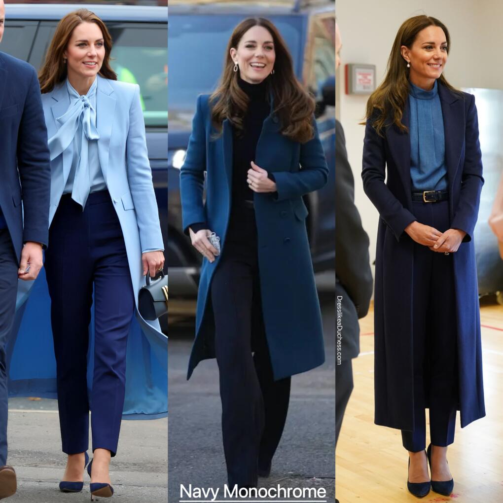
1. Navy Monochrome
The princess always looks polished in shades of cobalt and cornflower. Often wearing navy and sky shades for royal engagements, Kate loves the look of professional separates in coordinating blue hues. The princess is especially fond of pairing a powder blue bow blouse with navy cigarette trousers and a deep sea colored coat. She often wears a croc embossed belt, gold earrings and a navy top handle DeMellier bag with her blue on blue styles.
Benefits: Less severe and somber than all black, midnight hues are easy to match
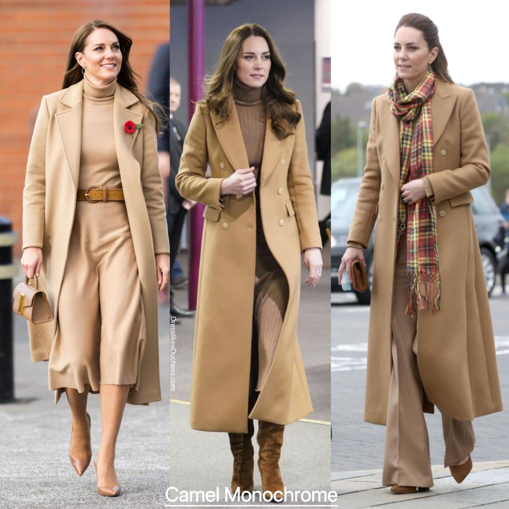
2. Camel Monochrome
One of Kate’s favorite neutral fashion ensembles is an all camel outfit. The fall-friendly tan hue is full of possibilities for layering and juxtaposing with other caramel colors. A classic camel coat never goes out of style– that’s why the topper is a favorite closet rerun for the princess. Kate prefers her camel ensembles to include turtlenecks for offering a conservative workwear vibe and loves to add suede footwear like Gianvtio Rossi Glen suede block heel boots to her soft sandy royal daywear.
Benefits: Camel coordinates with nearly ever color for a cool cohesive look, the hue can be dressed up with accessories like scarves and statement belts
3. Red Monochrome
The late Queen Elizabeth was a super-fan of dressing in bright and bold colors so that even the furtherest fan could spot the monarch in large crowds. Kate has echoed the late queen’s style signature by donning cohesive colors in vibrant shades. Lately, the princess has been fond of dressing in cherry colored separates, trouser suits and coats. Often drawn to scarlet colors when she’s looking to inspire or impact, Kate loves candy apple and lipstick shades for making a strong style statement. Kate’s cohesive crimson coloring makes her look elegant and eye-catching.
Benefits: Red is sensual and sultry without being too provocative, the color is associated with courage and confidence

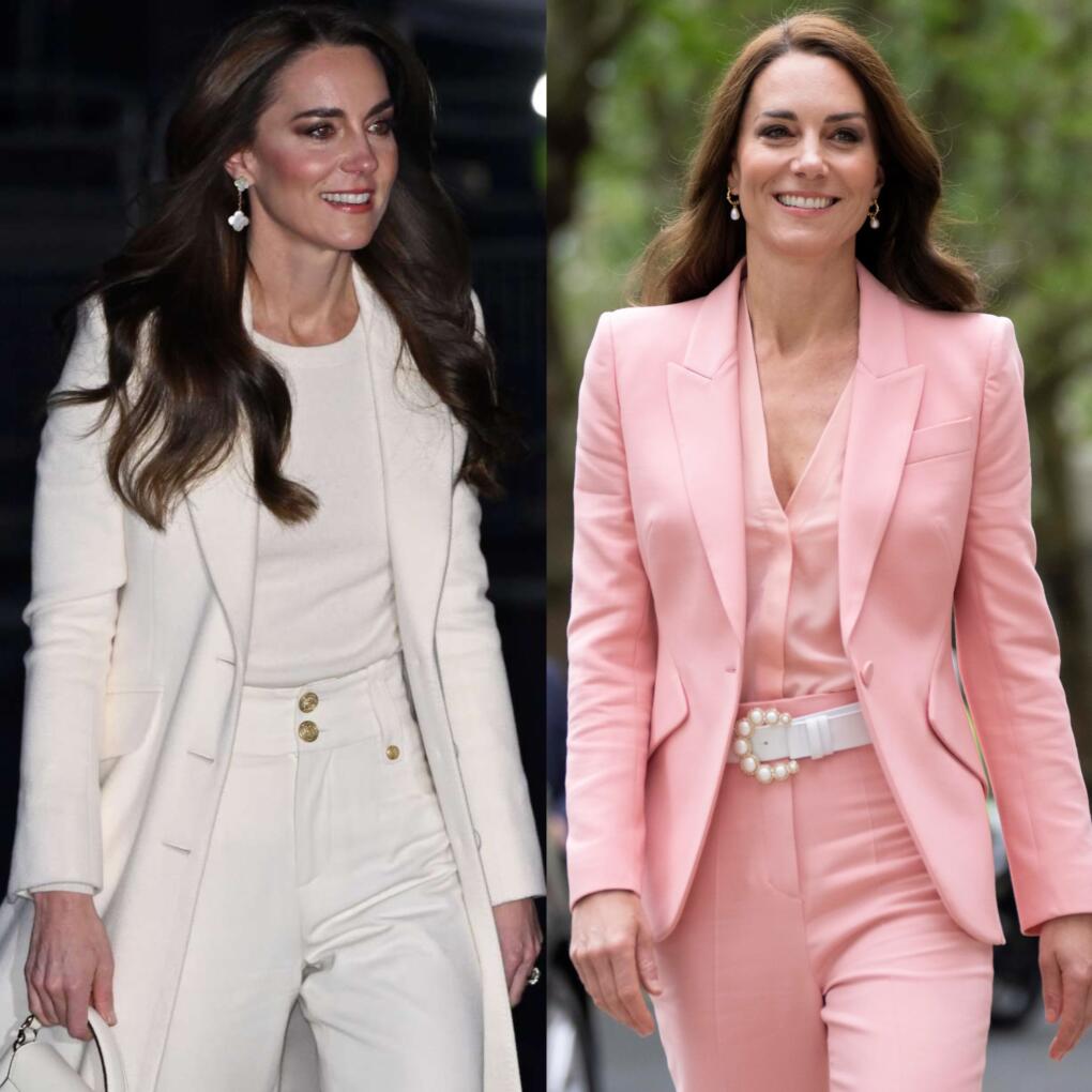
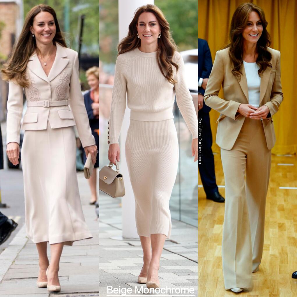
4. Beige Monochrome
When she wants to look put together and polished, Kate often turns to beige or biscuit shades. The simple and soft vanilla tone looks clean, fresh and sophisticated. Kate prefers dressing in cream or buff shades for daytime royal engagements and has worn the pale parchment shade in the form of a Self-Portrait tailored blazer midi dress, Sezane separates and a Roland Mouret pantsuit.
Benefits: Almond shades are easy to dress up or down, minimal accessories are needed
5. Blue (or Teal) Monochrome
Symbolizing security, stability and serenity, blue is a powerful statement shade. Kate loves oceanic colors when she’s attending major royal functions or in business mode. The calming color is easy to pull of as it works like denim and can be mixed and matched with other similar shades of sapphire. A major player in Kate’s fashion rolodex, royal blue is one of her signature clothing colors. (It’s also the shade of some of her most precious and priceless jewelry including her sapphire engagement ring and heirloom jewels from Princess Diana’s collection).
Benefits: Creates a sense of sartorial simplicity and harmony, makes a minimalist and modern fashion statement

6. Burgundy Monochrome
More refined and regal than Barbie pink, burgundy is a sophisticated feminine color without the flashiness of doll dressing. Kate embraces this maroon hue for workwear and dress coats. She loves shades of merlot for glitzy royal engagements and corporate chic styles. In addition, she almost always pairs her mulberry ensembles with matching Gianvito Rossi 105 burgundy pumps.
Benefits: Berry tones are flattering to every skin tone, garnet shades can work for day or night fashions

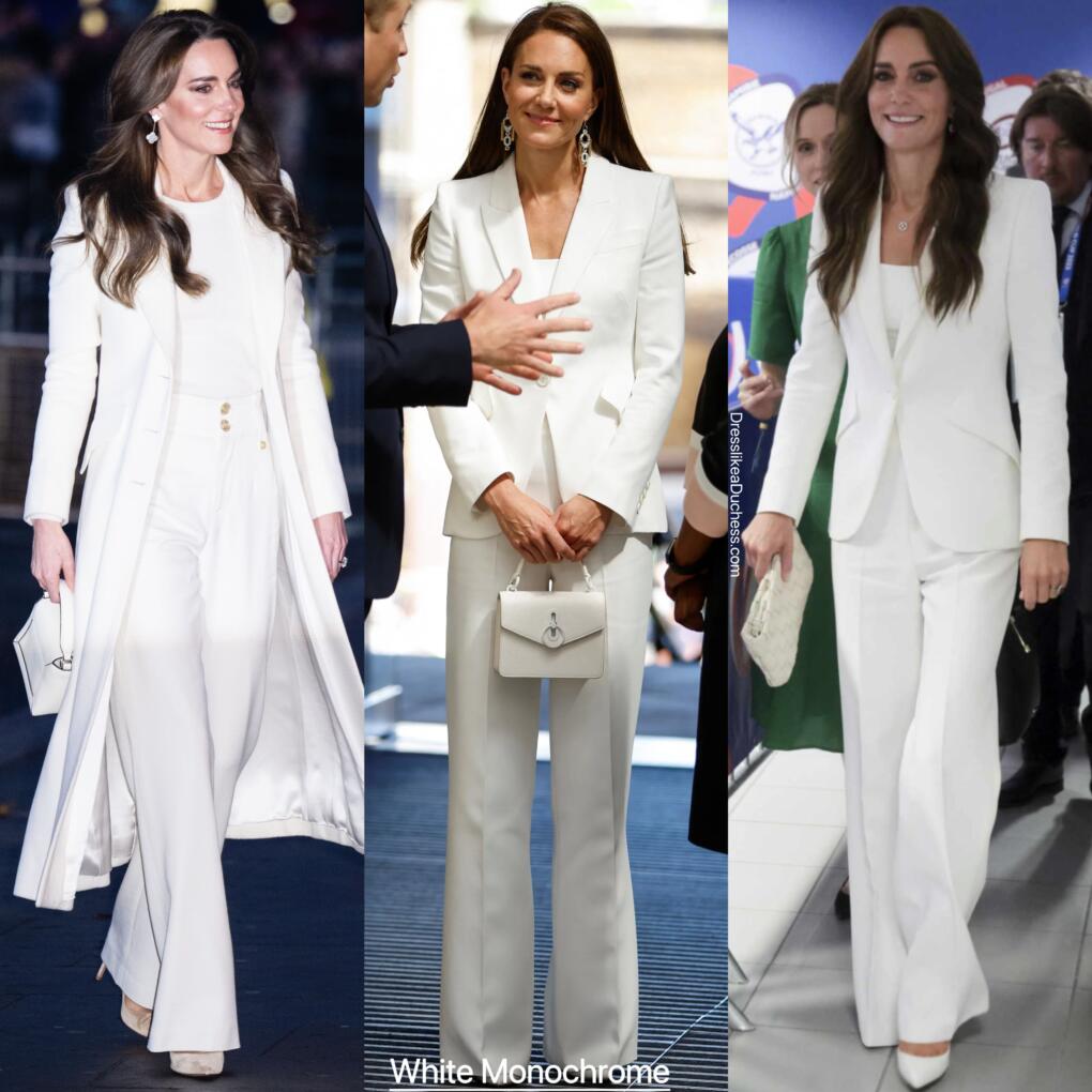
7. White Monochrome
Call her an Ice Queen. Recently, the Princess of Wales has embraced snowy styles and all-white outfits in a big way. Crisp, clean and chic, these chalky fashions make Kate look elegant and enchanting. A classic and cohesive fashion statement can easily be achieved with white trousers and a matching milky sweater or an all ivory pantsuit.
Benefits: Cotton colors look sophisticated and streamlined, vanilla shades are effortless and elegant